No Noise
Shopify build for a quiet-luxury label selling mercerised Supima cotton essentials.
Project Details
Results
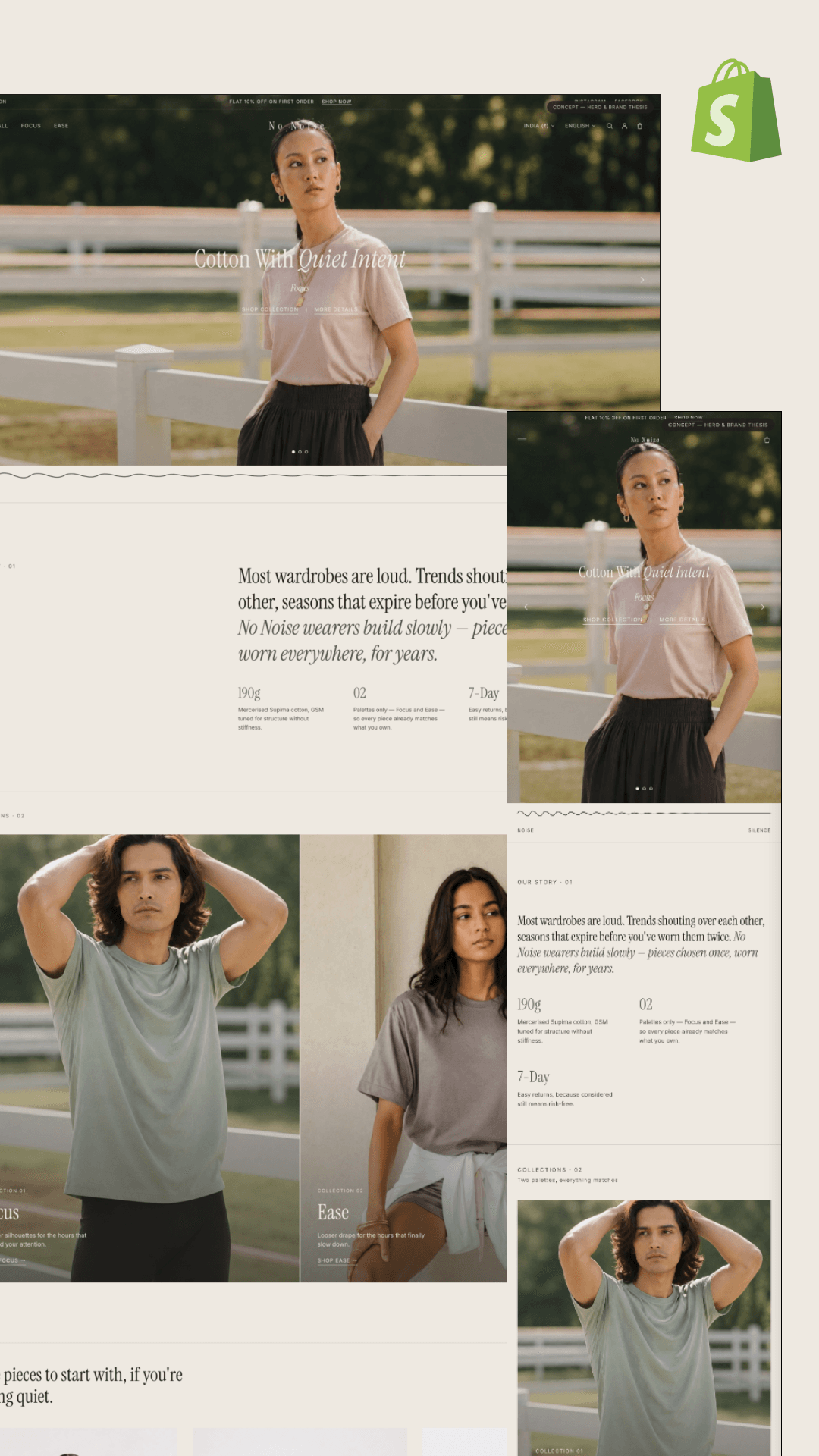
No Noise sells the opposite of impulse — mercerised Supima cotton tees at ₹2,199–₹3,199 that are meant to be bought once and worn for years. Their whole thesis is a rejection of how fashion stores normally sell: "Most wardrobes are loud. Trends shouting over each other, seasons that expire before you've worn them twice." A conventional Shopify theme fights that directly — grid walls of SKUs, countdown banners, badge spam. The store had to argue for restraint while still converting, on a catalog small enough that a standard collection grid would look empty rather than deliberate.
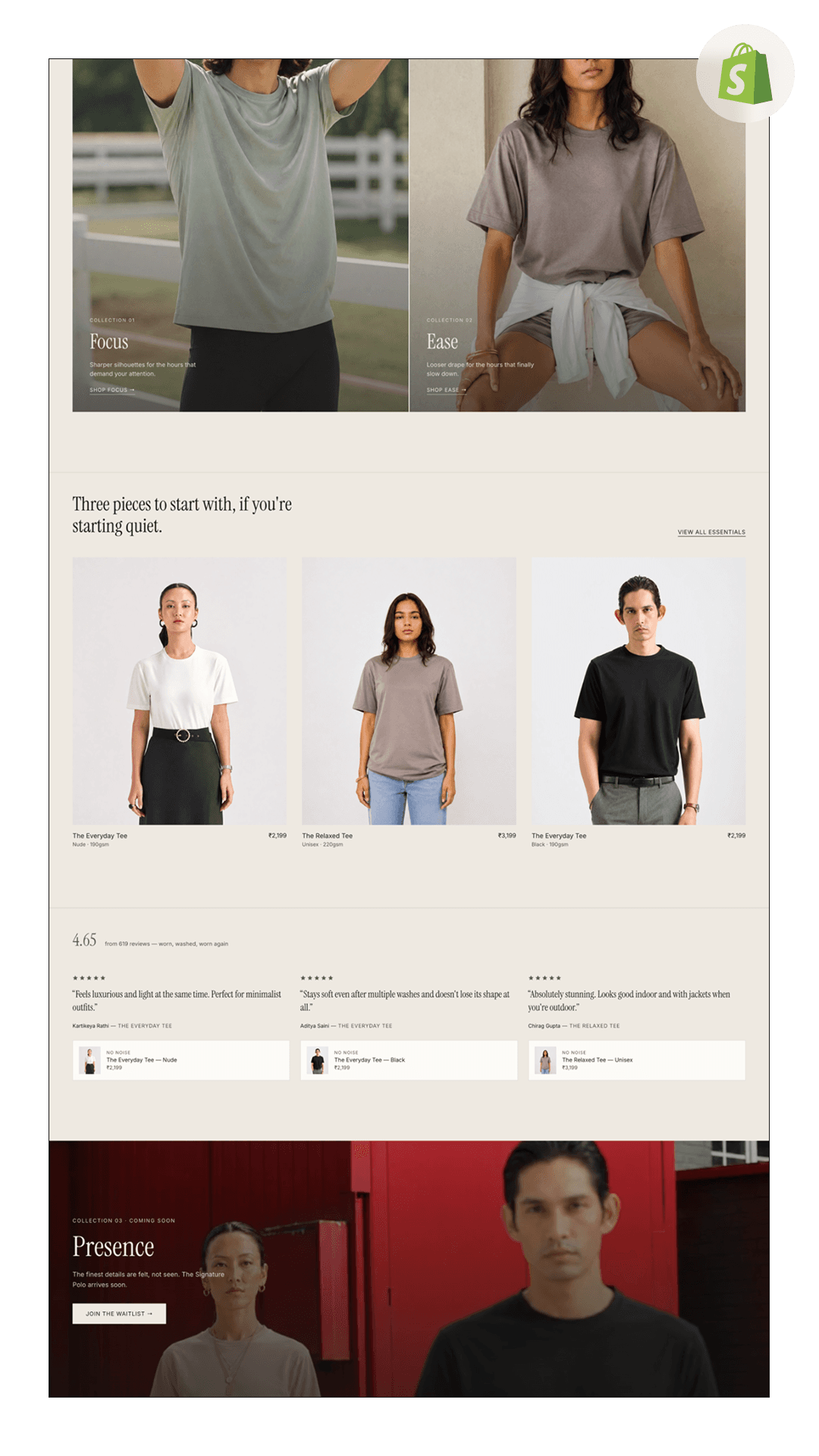
We built an editorial storefront that reads as a thesis, not a catalog. The homepage runs as numbered chapters — Our Story 01, Collections 02, Collection 03 — with a serif display face and a hairline noise-to-silence divider carrying the brand metaphor. The catalog is split into exactly two palettes, Focus (sharper silhouettes for the hours that demand your attention) and Ease (looser drape for the hours that finally slow down), so a small range reads as an editing decision rather than a shortage. Product cards lead with fabric spec — 190gsm, 220gsm, palette name — instead of discount badges, a "three pieces to start with" entry rail lowers the first-purchase decision, and a stacked review wall (4.65 from 619 — worn, washed, worn again) carries proof of longevity. Collection 03 “Presence” ships as a waitlist capture ahead of the Signature Polo drop.
Gallery
Process
Brand Thesis & Scope
Translated the founder's positioning — buy once, wear for years — into a page structure that argues restraint, and set the two-palette constraint that shapes the whole catalog before touching Shopify.
Editorial Design & Build
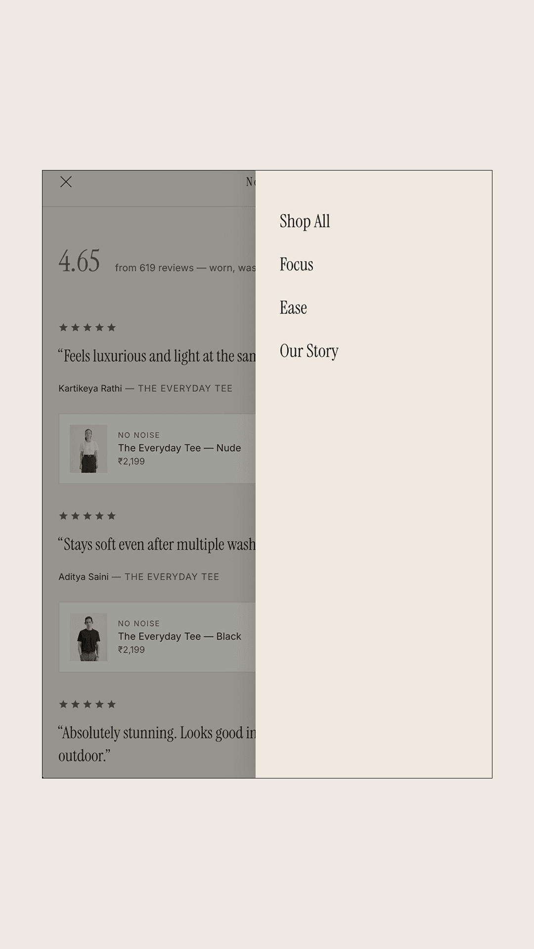
Built the chaptered homepage, the Focus/Ease collection split, and a product template that leads with GSM and palette rather than promo badges — plus an off-canvas nav trimmed to four destinations.
Merchandising & Proof
Shipped the “three pieces to start with” entry rail, the review wall with product cards inline under each quote, and the ₹/English locale switcher for the India storefront.
Launch & CRO
Wired the Presence waitlist ahead of the Signature Polo drop, moved the 7-day returns promise up beside price, and tuned the first-order offer so it reads as an invitation rather than a discount banner.
Every agency wanted to add more — more banners, more urgency, more product. This is the only build that understood the brand is the restraint. It looks like the clothes.
Frequently asked questions
Want a store like No Noise?
Tell us about your project — we'll come back with scope, an estimate, and a timeline.
